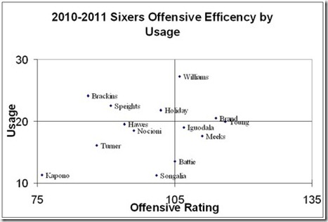
The below graph (courtesy of LibertyBallers.com) shows the Sixers’ offensive efficiency by player.
According to LibrertyBallers:
So, this graph tells me:
1. a. The Sixers need an effective go-to guy. The top right hand quadrant is for high-usage, high-efficiency players, where you’d find LeBron or Dirk for example. Our supposed ‘superstar’, Andre Igoudala, has a usage and an efficiency rate lower than that you’d like to see from a team’s top dog.
b. The fact that the Sixers’ highest charting player, Lou Williams, doesn’t even start seems as though it should be a concern for someone.
2. Evan Turner’s placement on the chart isn’t pretty, but shouldn’t move you to give up on him yet. A 20-year old rookie is bound to go through some ups and downs, and his low level of efficiency to this point in his rookie season doesn’t mean he can’t turn things around. Also, Turner has played more effectively with Igoudala out of the lineup, and considering the trade speculation surrounding Iggy, this could soon be Turner’s team.
3. More PT for Thaddeus Young!! Thad is the Sixers most efficient player, yet his usage is low. I have been an advocate for increased minutes for Young all season, and this chart illustrates his effectiveness. More minutes = more positive production.
Bonus: I felt that it was worth pointing out that all of the team’s Caucasian players are located in the lower left (low-usage, low-efficiency) quadrant; coincidence?? Or maybe they’ve all just been watching too much White Men Can’t Jump.
The chart can provide important information for the rest of the season, as ideally we would like to see Igoudala elevated to the top right box, increased minutes for Thaddeus, and an ever-improving Evan Turner.

1 comments:
Graph also illustrates that Jodie Meeks has come back to earth a bit. He seems to be a good fit for the team, but a starting two-guard on an NBA team? I don't know about that.
Post a Comment